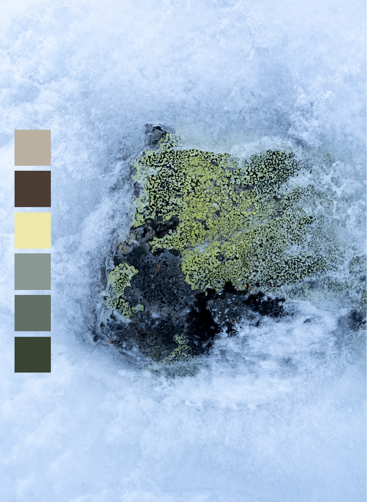
Color story | Fall/winter 2026
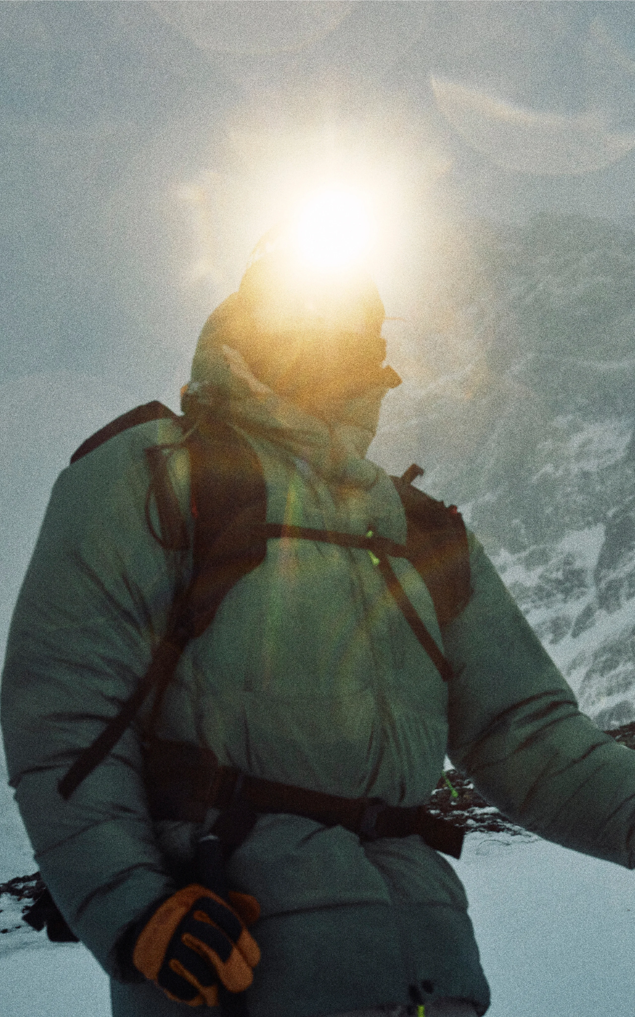
Color story Fall/Winter 2026
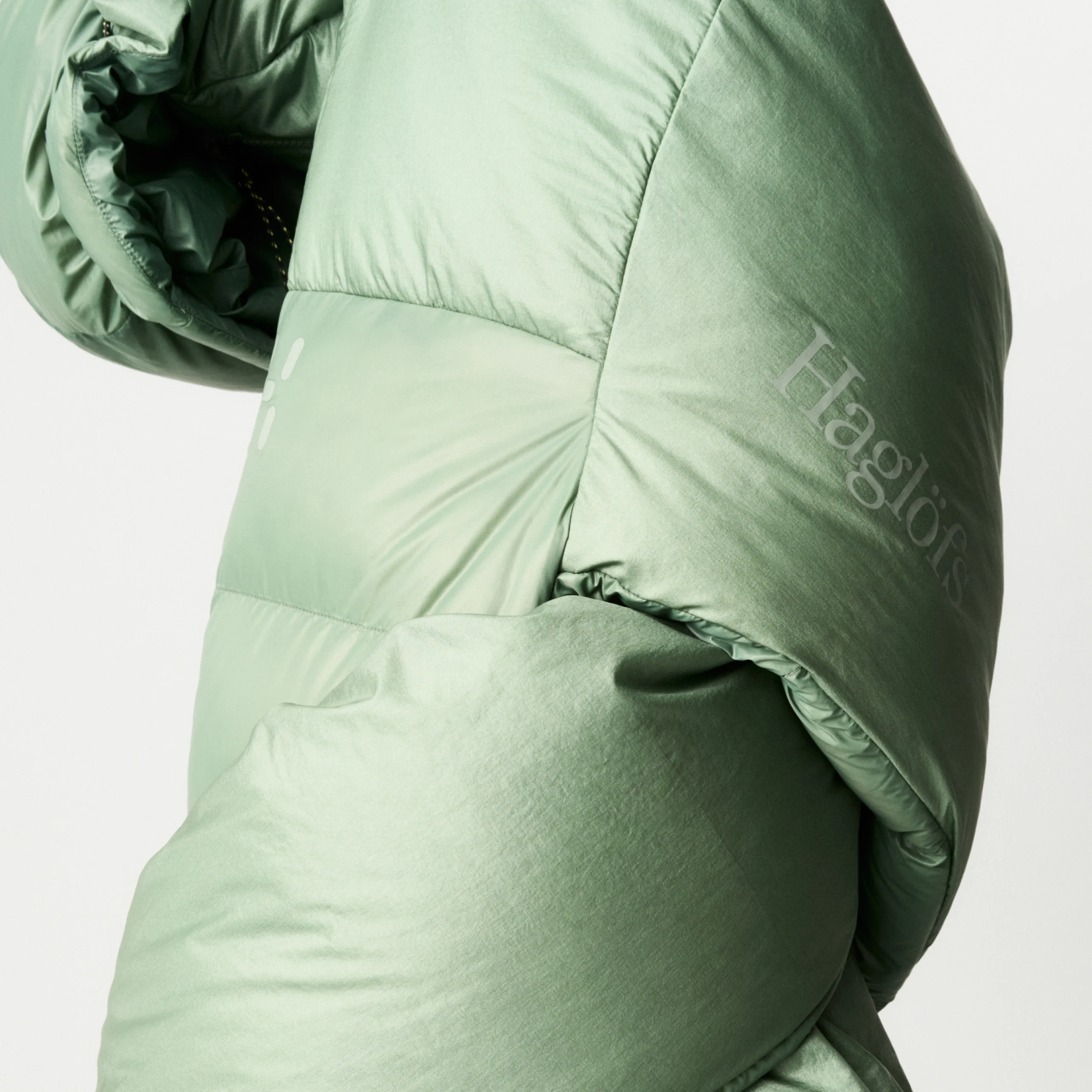
Free to wander
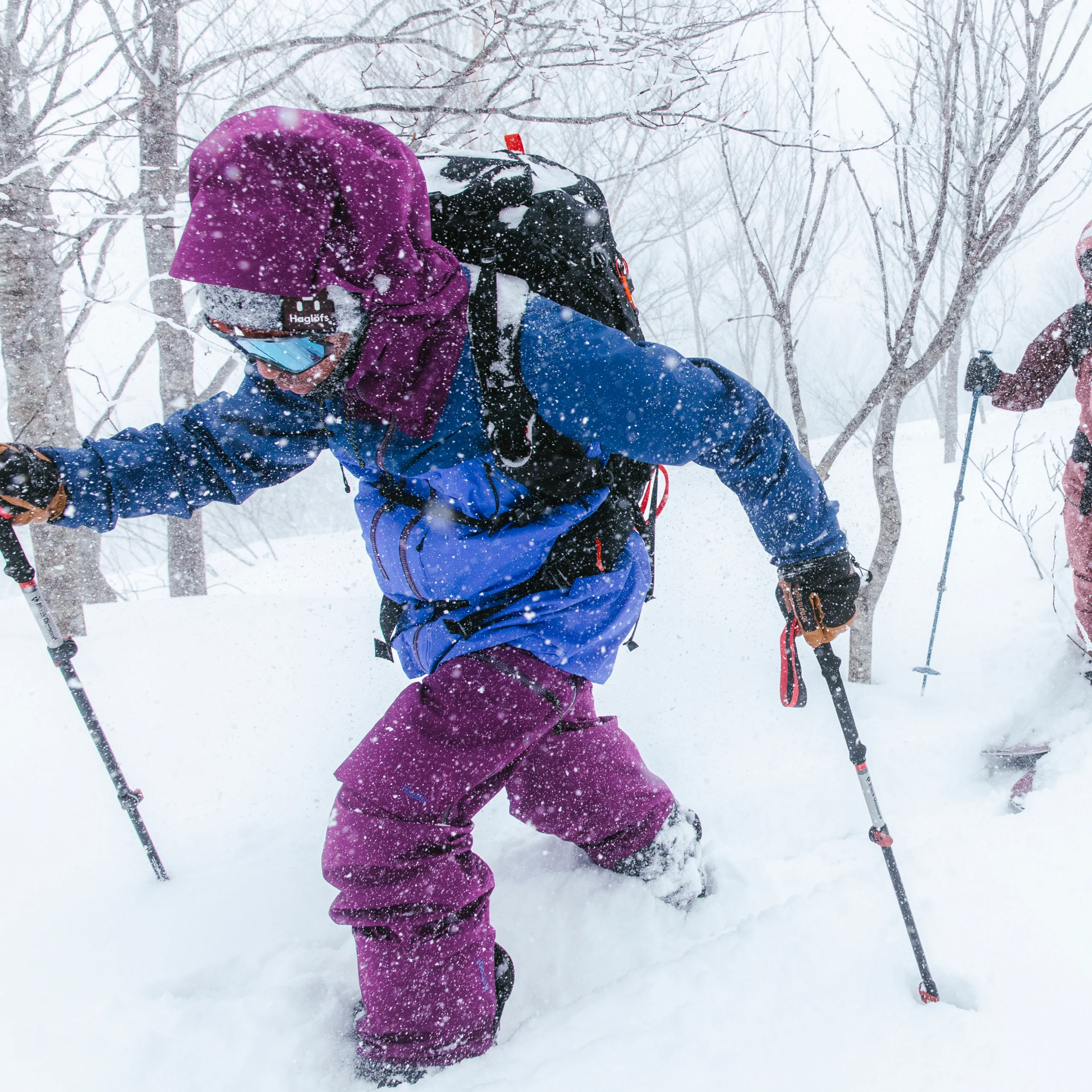
Inspired by early starts, high tempos, and endless outdoor exploration, this season’s color story wanders from light, warm-weather hues to layered tone-on-tone combinations and bold color accents. A palette that moves with you through shifting light, changing temperatures, and the longer, freer days of summer.
Chlorophyll
You step out just as the city is slowly awakening. Concrete-gray shifts into soft shades of pink and red, interrupted by flashes of technicolor yellow, and the low light and clear air focus your every movement.
This palette captures the transition from urban stillness to the serenity of the nearby forest. Structure meets energy, and the day begins with intention. Featuring seasonal colors Purple Fog and Morning Trail.

Seaweed green
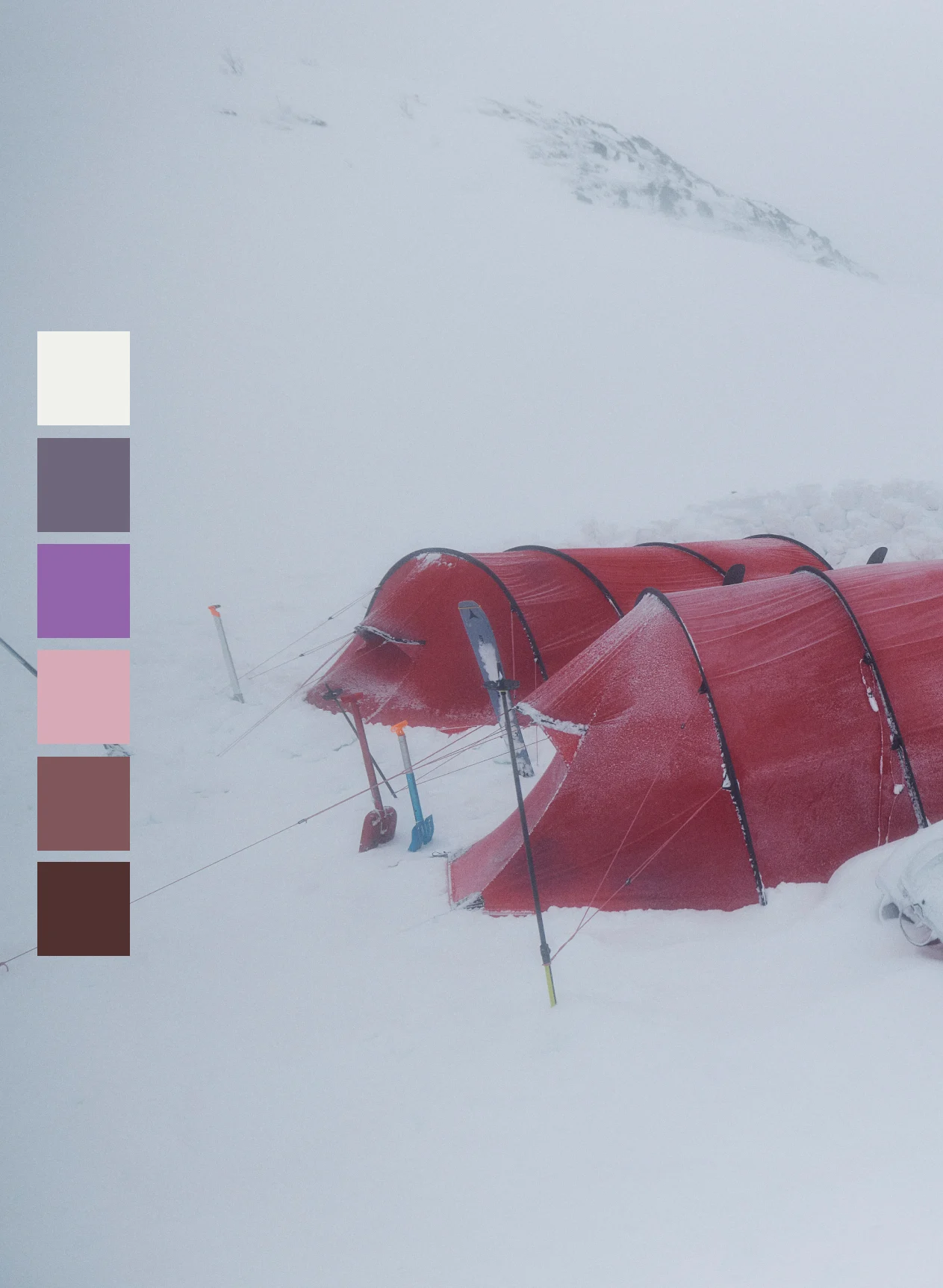
Trembeling earth
You step out just as the city is slowly awakening. Concrete-gray shifts into soft shades of pink and red, interrupted by flashes of technicolor yellow, and the low light and clear air focus your every movement.
This palette captures the transition from urban stillness to the serenity of the nearby forest. Structure meets energy, and the day begins with intention. Featuring seasonal colors Purple Fog and Morning Trail.
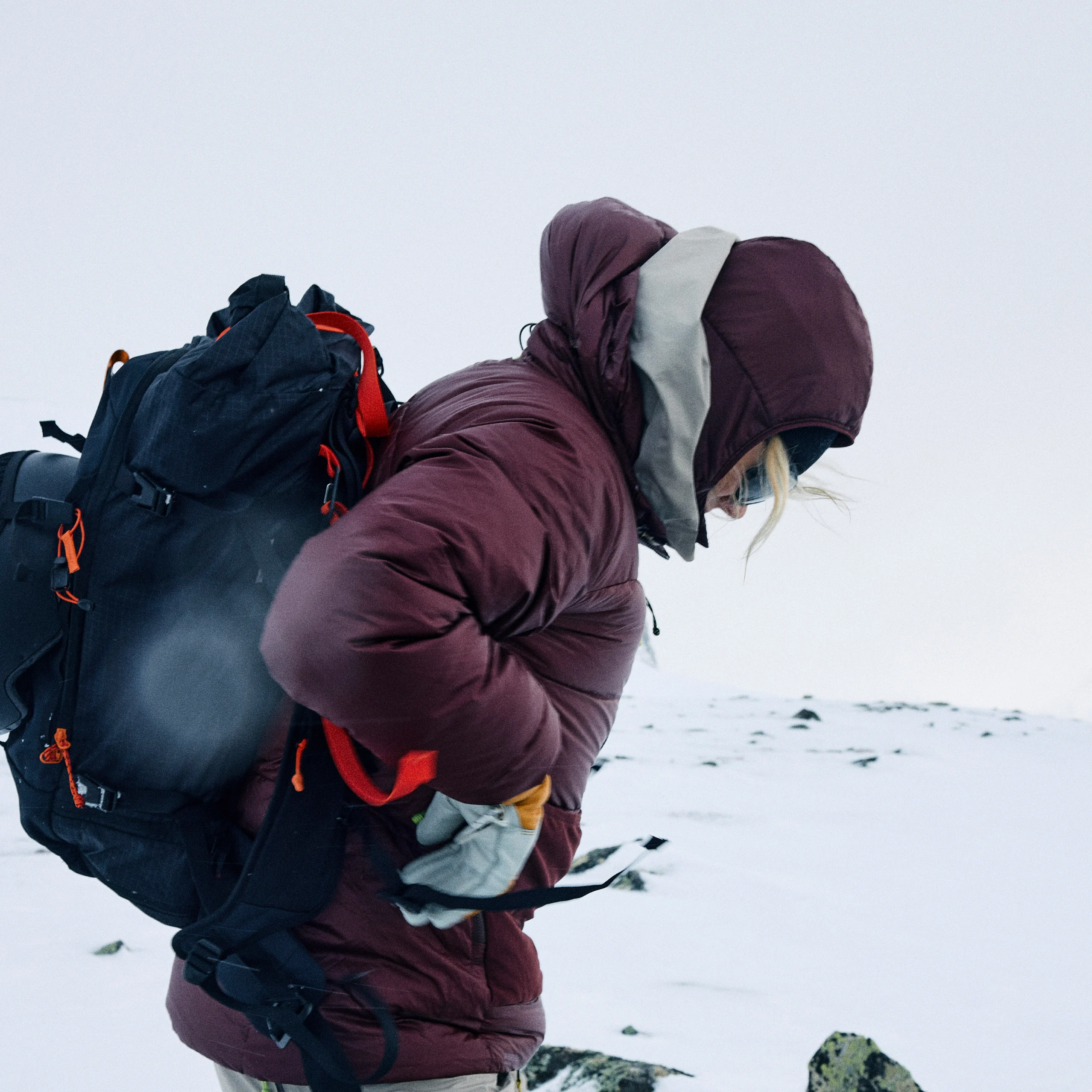
Maroon trail
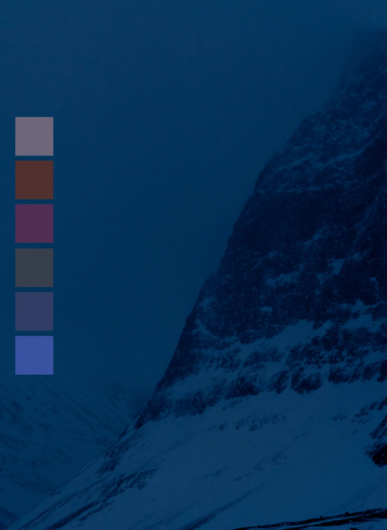
Arctic line
You find yourself at the heart of the forest. Standing beneath the canopy, energizing greens envelop you while bright rays of yellow sunlight filter through, illuminating your surroundings.
This palette captures the clarity and rejuvenation we find in the wilderness. Grounded, refreshing, focused, and full of movement. Featuring seasonal colors Chlorophyll Green, Dew Green, and Yellow Rise.

Northern blue
To show this video you need to allow cookies
How We Choose Colors
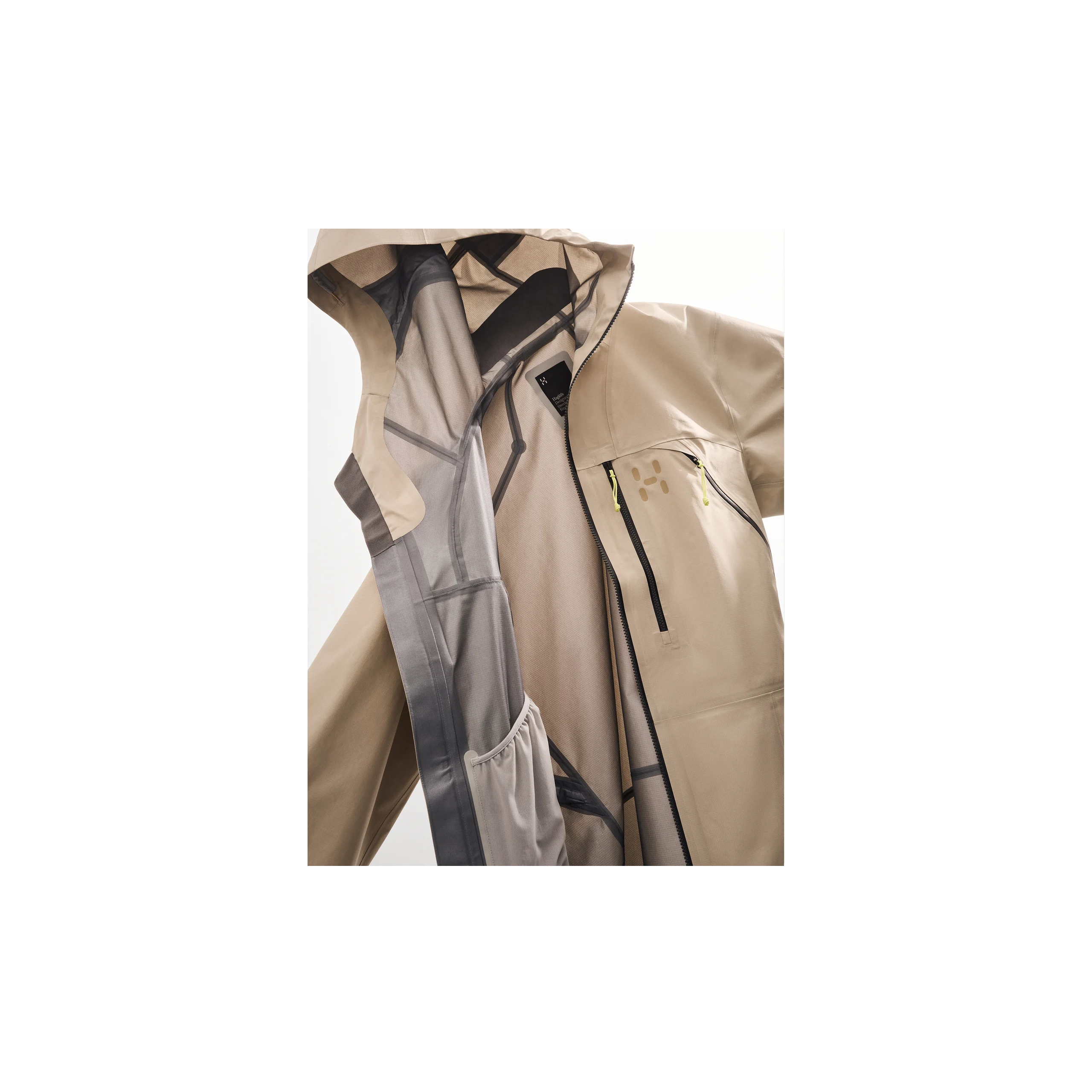
Our color direction is guided by a structured, seasonal approach and shaped by the Swedish light as it interacts with the landscape, materials, and performance. The result is an enduring palette where nature and technology coexist.
Earth-based, muted core tones provide stability and integrate seamlessly into the environment, while forming a steady foundation season after season.
Technical, high-visibility colors emphasize function, clarity, and performance, creating contrast where it matters and highlighting the product's purpose.
Seasonal accents reflect shifts in light, temperature, and mood, keeping the palette dynamic without sacrificing structure.
This balance—between restraint and intensity grounding and precision—defines our color language. Not decorative. Not nostalgic. Functional, deliberate, and ready to perform.
Become a member
Get 10% off & members-only prices.* As a member, you’ll get early access, first looks at new arrivals, and exclusive offers — straight to your inbox.
*Includes 10% off your first purchase and exclusive savings on select gear. Offers cannot be combined.